The Wrenchies, COPRA
October 20, 2014—Hand-drawn, -inked, and -watercolored, Farel Dalrymple's The Wrenchies is quite a sight. Its three hundred and some pages are loaded with gangly, eyeball-splitting demon figures and ruddy-faced kids either swinging baseball bats or throwing punches. It's a post-apocalyptic war story that essentially pins a team of kids ("We all know the world is super fucked but what can we do?"), conceived in a comic book, against lousy odds of survival on a "once lush and beloved Earth (now) filthy with demons."

Whimsical names and characterizations—Herzog Duke; Sherwood Breadcoat; a rotund daydreamer called Hollis, clad in a distressed-red skintight superhero costume—perhaps give the impression that the Oklahoma-born creator's cosmic, painstakingly detailed graphic novel is one better suited to young audiences. A violent face-off with one of the tale's mucous-colored ghouls that transpires in the first few pages of The Wrenchies—at the foot of Wood Sinner Cave, where dead crows litter the ground—shatters that theory entirely.
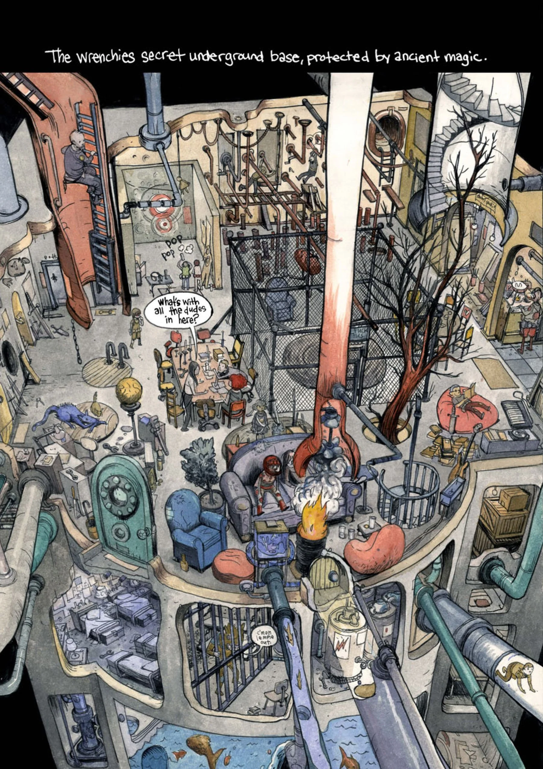
Dalrymple's pages are dynamic and fresh, with knotted, branch-like appendages of the book's monsters often extending out past the lines that attempt to box in the action. Hand-shaped horizontal panels yield varying sizes and an irregular amount of gutter space from page to page, while vertical panels sometimes bleed into the page's edge. Dalrymple fills out backdrops with impossibly intricate line work and exposition that loads the pages with text that can amount to a mouthful on occasion:
"All of the stored metaphysical energy from killing demons and years of exposure to the amulet's enigmatic radiation primed his body for such a purpose."
There are gorgeous washed-out tones in the book's ornate subterranean lairs or barren fields, which are dotted with demons and dead trees. Here, I love how the dim reds, blues, and algae greens pop against the page's otherwise subdued color scheme—and the way that the generous perspective of the artist's tangle of pipework, ratty furniture, and general whirlwind of activity offers the most ideal peek possible at what's less a fort than it is its own microcosm.
Narrative threads similar to those of The Wrenchies run through the less coherent but marvelously crafted and ongoing "It Will All Hurt" at Study Group, while Dalrymple will also be featured in Little Nemo: Dream a Little Dream, a hugely successful crowd-funded project from West Philadelphia comics shop and press Locust Moon. We got a glimpse of The Wrenchies last October, when a rough sketch of Dalrymple's scrappy cast closed out Locust Moon's weird and compelling quarterly comics anthology, Quarter Moon.
COPRA is exactly the kind of book that the staff at Locust Moon's store have likely championed in the big horizontal racks in the front of the shop. Like Dalrymple's work, Michel Fiffe's off-kilter superhero story is all him—he pencils, writes, letters, colors, everything, and has been cycling through all of that on this title since late 2012. Initially published serially back then under an imprint he launched with a well-liked anthology called "Zegas," the first six issues are collected in COPRA: Round One, which is published in South Brooklyn by another small comics shop and independent press called Bergen Street Press.
Those who have a history with DC Comics' Suicide Squad will find a lot to love in Fiffe's work—but as I don't know those characters at all, I'll leave that to Comics Alliance's Chris Sims, or to Fiffe himself to explain why. No matter what the title, however, readers of a certain age will likely identify with the breathless nostalgia for old, well-done superhero stories here.
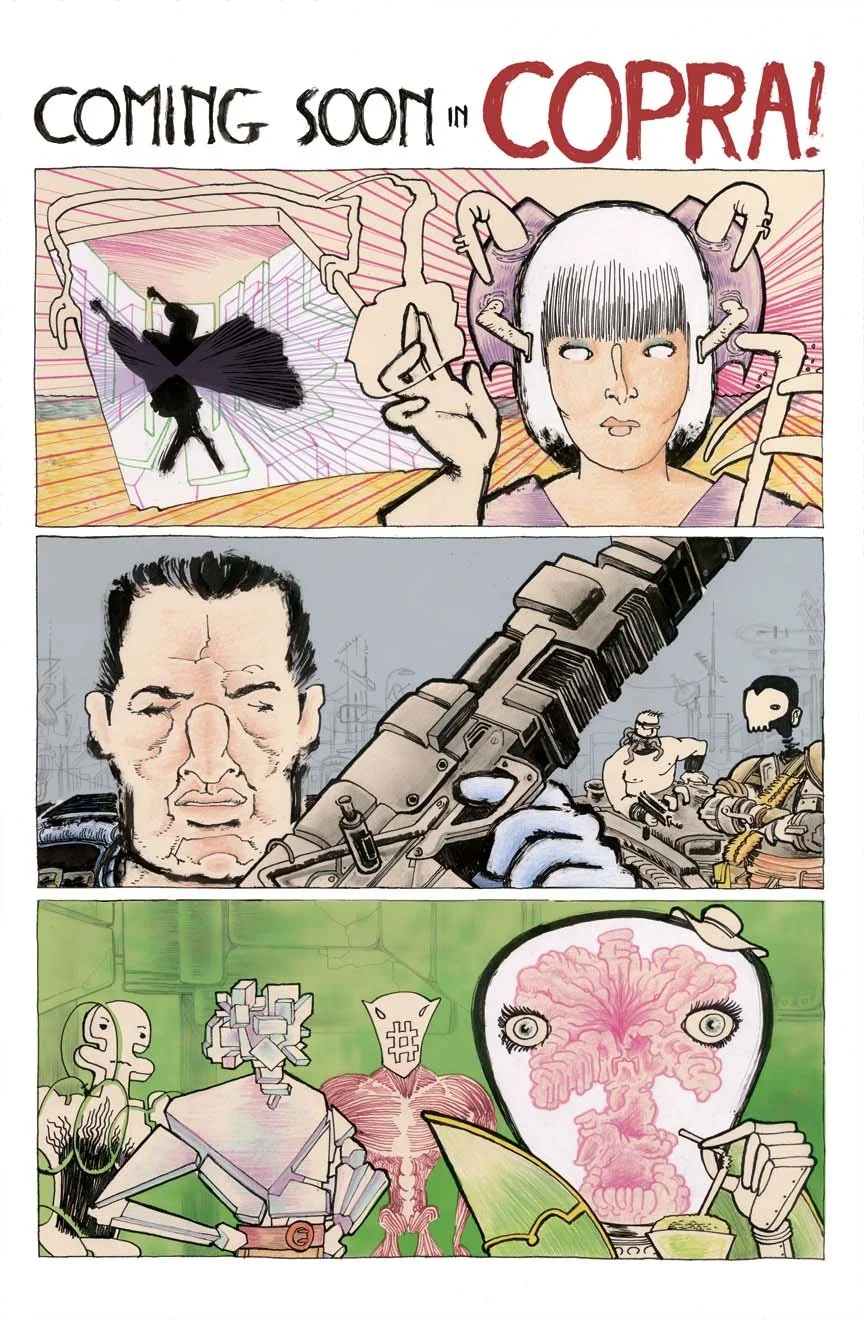
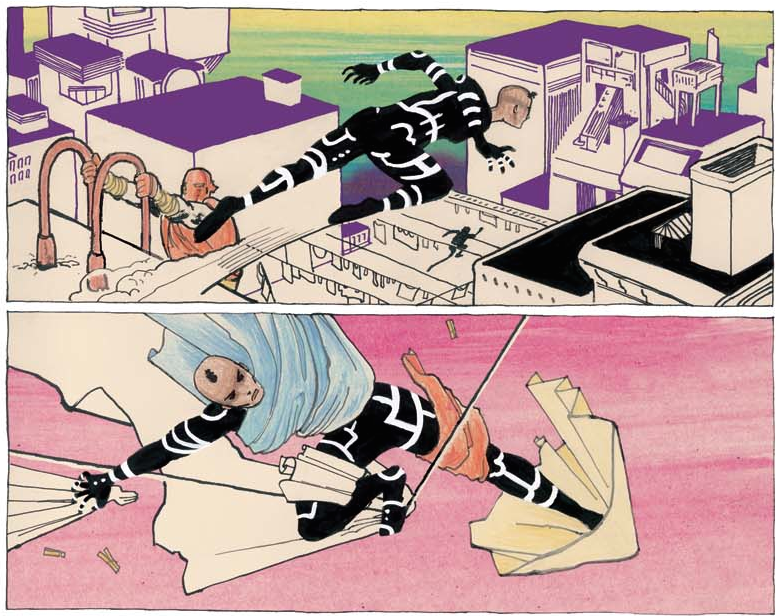
Fiffe's "grimy, damaged" team of government agents—Sniper, Brawler, Man-Head, and more—are self-described "loser assassins" who don weird angular costumes that are streaked with flourishes that are part-Pop art and part-1980s punk rock. If they're not lean and bounding into the stratosphere, they're bulky and aggressive, fielding loads of violent clashes and deploying high-tech weaponry. While the script is the sort of thing that would primarily hook those who are already knee-deep in superhero books, there just doesn't seem to be anyone doing superhero stories like this right now.
Fiffe's visuals are vibrant and cleverly executed. Ideas that are sometimes brought to fruition just a few panels apart are communicated so differently from one another that it looks like the work of two different artists.
Horizontal panels bookend a rainy night sequence in the second issue that has COPRA members Patrick Dale and Sonia Stone seeking out a confidant for help at his apartment. The top panel is rather smudgy and is indicative of a heavy reliance on shadows. There are stray splashes of red and yellow, and it almost looks unfinished. The panel at the bottom of the page is adversely characterized by clean black contour lines that shape the two figures. Shadow is barely worked-in for the latter, with Fiffe depicting the inclement weather in sporadic and singular pen strokes.
COPRA's punch-ups are frenetic and exciting, with the bad guys frequently clocking-out in neon-streaked implosions that dominate the pages. But I found myself marveling over the sequences that materialize outside of the frequent battle scenarios, where Fiffe demonstrates a proficiency with ornate page layouts as well as graphic design finesse even though his heroes have momentarily tucked away their wrist cannons.
The Wrenchies images © 2014 Farel Dalrymple. COPRA images © 2014 Michel Fiffe.