Bossa nova's break and a question of cover art
I'm looking forward to getting into João Gilberto and Stan Getz's Getz/Gilberto, a new entry in Bloomsbury's "short books about albums" 33 1/3 Brazil book series from author Bryan McCann.

In his book, the Georgetown University Latin American History professor examines the origins and success of Getz/Gilberto, the 1964 landmark bossa nova LP from Philadelphia-born jazz saxophonist Stan Getz and Brazilian guitarist João Gilberto. Getz/Gilberto won multiple Grammy Awards and saw singer Astrud Gilberto's rocketing to international fame by way of "The Girl From Ipanema" leading off the album.
Issued by Verve and produced by Creed Taylor, Getz/Gilberto helped spread the gospel of bossa nova for an American audience that was hooked on the genre—the record hit stores not long after Getz's and guitarist Charlie Byrd's Jazz Samba, which stormed radio charts and sold more than a half a million copies in less than two years.
In the run-up to the new book's release, a blog post from McCann in late November had the author looking at Stone Flower, the airy, atmospheric LP from Antônio Carlos Jobim, whose piano work figures prominently into Getz/Gilberto and who has writing credits on nearly all of the record that McCann studies in his book.
At 333Sound.com, McCann unpacks Stone Flower's relationship with a Jobim-penned film score and wonders why the 1970 album, which has been called Jobim's Kind of Blue, never had the success that his previous efforts enjoyed. It may owe at least somewhat to aesthetics:
So why didn’t Stone Flower achieve the same fame as Wave (much less the universal recognition of Getz/Gilberto)? It has something to do with timing—the Brazilian sound was still hip for jazz cats in 1967, when Wave came out. By 1970, the U.S. jazz audience had fractured into smaller segments, making it more difficult to attract a sizable audience for any venture—and the orchestral Brazilian sounds of Stone Flower, bewitching as they are, did not appeal broadly.
But I think it is primarily a question of cover art. Getz/Gilberto, in addition to its many musical virtues, had the stunning cover art of Olga Albizu’s painting “Alla Africa” set boldly on a black background. Wave had a striking cover design by Sam Antupit featuring a Pete Turner photograph of a giraffe standing in shallow water, set against a starkly monochromatic background—emerald in some printings, scarlet in others. (The giraffe was inexplicable, as giraffes inherently are.) The cover of Stone Flower, in contrast, shows Jobim in profile, wearing a blazer, pressed shirt and tie, smoking a cigarette.
By the time Creed Taylor had won a Grammy for his production work on Getz/Gilberto, visionary magazine photojournalist Pete Turner had already established a years-strong relationship with him. Turner was running a color print lab for the Army in Long Island City, Queens in the late 1950s when he decided to call Taylor—then a producer at ABC-Paramount's Impulse! jazz label—about showing him some work after seeing Taylor's name on jazz record sleeves at shops in Manhattan.
Their first meeting was a good one: Turner's gorgeous images appeared on many jazz album covers in the years that followed—such as those for Dizzy Gillespie, Lee Konitz, and John Coltrane, among others—and that was well before they would help define the identity of the Taylor-founded CTI records.
First a subsidiary of A&M, CTI (eventually) was home to venturesome and fascinating fusion projects from the likes of Freddie Hubbard, Bob James, and Joe Farrell, each produced by Taylor. Sure, the catalog isn't without some unlistenable, totally over-orchestrated bores, but CTI's founder didn't hide his inclinations toward pop music or commercial success when he mapped out ideas about merging jazz with other types of music. He sought big hits, purists be damned.
Taylor talked to Devin Leonard at Wax Poetics in 2009 about his intentions for the label in that regard:
"Why did I use strings on so many records? Because I wanted to get them played on the radio. It's as simple as that."
Whether or not the records were consistently interesting, they looked magnificent, and all of the real estate on the sturdy gatefold sleeves that usually housed them was put to use. Turner's photography—in concert with minimalist graphic design touches such as abundant margin space and reliably stark, all-caps block type from art director Sam Antupit, an ex-Esquire staffer—rendered these albums stunning in store bins. It was all part of the vision that Taylor had for his new label.
"Taylor personally oversaw every aspect of the production process," wrote Leonard at Wax Poetics. Turner's photography was a significant component of what Leonard calls the "high concepts" that Taylor favored, such as the Wave album cover art, for example.
A few years after in-demand engineer Rudy van Gelder recorded John Coltrane's A Love Supreme in his Englewood Cliffs, New Jersey-based studio, sessions began for the first record to wear the CTI logo. Written entirely by Antônio Carlos Jobim, the tracks for Wave's luminous, mostly instrumental bossa nova were laid down in May and June of 1967 and featured veteran Ron Carter on bass and no less than 13 violinists.
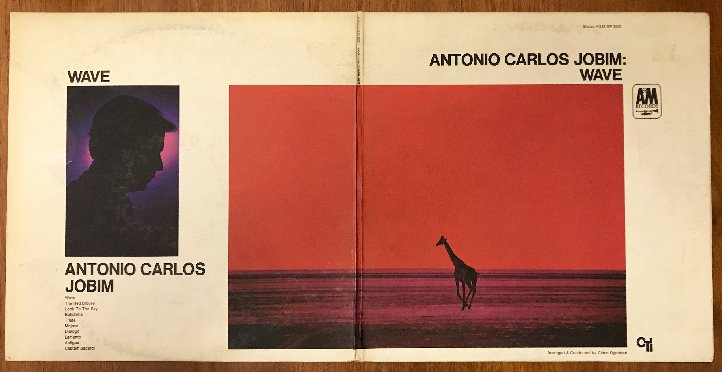
The strings don't enter Wave's opener (and title track) until a full fifty seconds have elapsed — by then, we've heard from the flute and brass session players, percussion, Carter's bassline, as well as the acoustic guitar chords that introduce this rather short piece and its rather short album. The latter instrument, as well as a piano lead, is performed by Jobim — the Getz/Gilberto author McCann notes in his book that although it garnered the acclaim of fans and critics alike, Wave didn't have the "star power" of guitarist João Gilberto (much less Astrud). But it had Turner's mesmerizing photograph of a giraffe that he'd taken a few years previous, when Getz/Gilberto was climbing the charts.
"I had this image of a giraffe with its legs in a perfect stride from a 1964 trip to Kenya," said Turner of his photograph for Rizzoli's The Color of Jazz. "But I didn't like the background, which was flat and colorless. Using an optical printer, I added color as a graphic element."
That color differs depending upon the press of the record you own. The cover image on the original copies of Wave had a striking red backdrop, while the ground beneath the giraffe had been rendered purple by Turner's manipulation of the original photograph, which was selected for 1967's "Photography in the Fine Arts" exhibition at the Metropolitan Museum of Art. A last-minute printer error turned the sky green for the 1971 reissue of the LP.
No matter the color, it's a now-iconic sleeve that stemmed from an idea that Turner had after a call from the boss at CTI.
"Creed said, 'Jobim has this tune, Wave. What you got, Pete?'" Turner remembers in an afterword for The Color of Jazz. "I'm thinking water will never ever do it. Then I thought about the giraffe image. It was one big home run. Even today, deejays still refer to it as the red giraffe album."
—
Bryan McCann's new book João Gilberto and Stan Getz's Getz/Gilberto is out now.